2026-04-08")


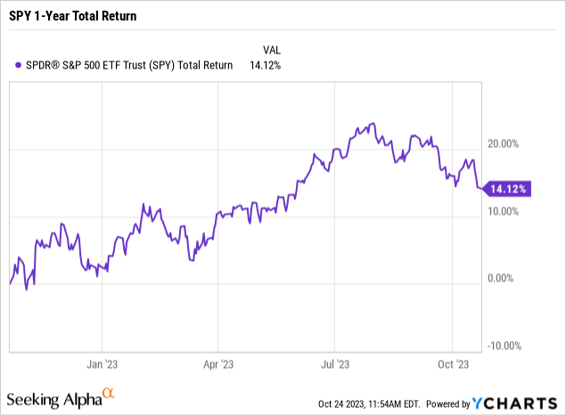
Despite a continually hawkish Federal Reserve delivering historically fast-paced increases in interest rates, the SPDR S&P 500 ETF Trust (NYSEARCA:SPY) has quietly managed to achieve double-digit returns over the past year. Is the resilience justified or a last gasp of hope before a nasty crash? This article covers the current valuation for SPY, interest rates, and Federal Reserve policy, along with the impact of easy monetary policy on historical returns. The data combines to paint an all too familiar picture of boom/bust cycles that end in recession, putting a timer on a probable major negative catalyst in SPY within the next 12 months.
Current Valuation
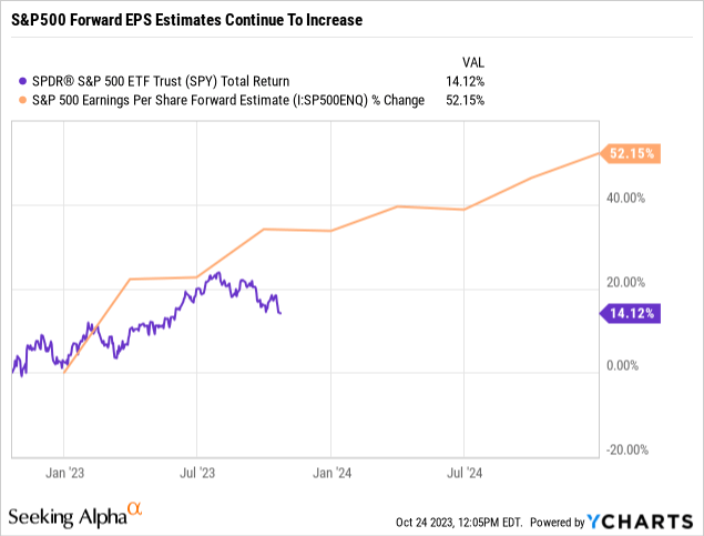
The 14% total return achieved by SPY over the past year would be considered completely justified when looking at the trend in forward EPS estimates for the S&P500.
As the following chart shows, forward estimates have increased by over 50% since the beginning of the year. Generally, equity prices reflect trends in forward earnings estimates.
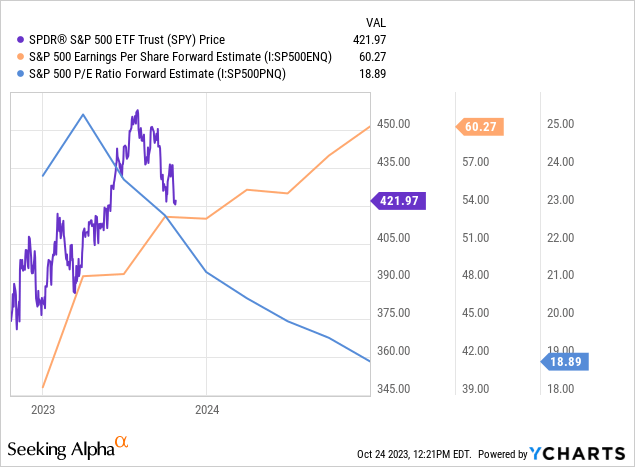
The increase in forward estimates has also quickly driven down forward P/E multiples by roughly 25% from ~25 to ~19 as shown in the following chart. SPY went from overvalued to fairly valued in a relatively short period of time.
Looking over the last 20 years, a forward P/E of ~19 doesn’t appear to be a sign of high valuation. Reviewing the chart below might conclude it’s pretty much in the window of an average valuation.
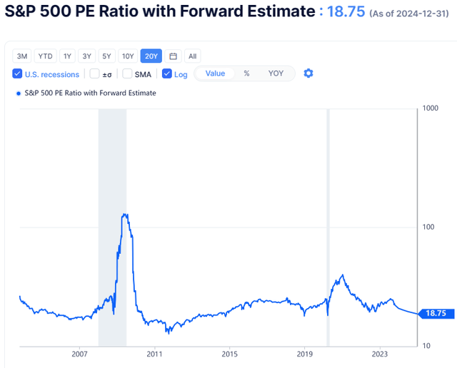
S&P500 PE Ratio with Forward Estimate (gurufocus.com)
The combination of increasing forward estimates on an average valuation multiple would usually point to clear skies ahead, but investor optimism seems muted. Perhaps it’s due to a story they’ve read before and perhaps it’s time for investors to fade analyst optimism.
Normalized Interest Rates
There’s been plenty to fear in equity markets lately as the yield on the 10-year treasury hit 16-year highs. As seen in the following chart, the yield on the 10-year treasury is at levels not seen since before the Great Recession.
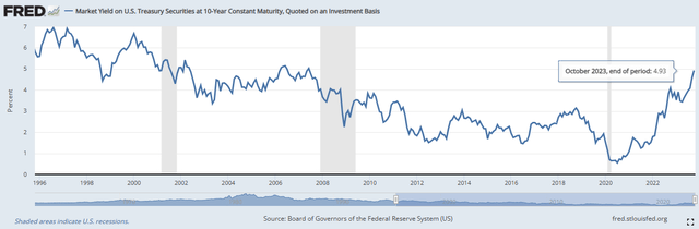
US 10-Year Treasury Yield Chart (fred.stlouis.org)
Yields in general have remained elevated largely as a result of normalizing Fed rate policy and a shrinking balance sheet. As seen in the following chart, the effective Federal Funds rate is back to levels seen in 2006-2007.
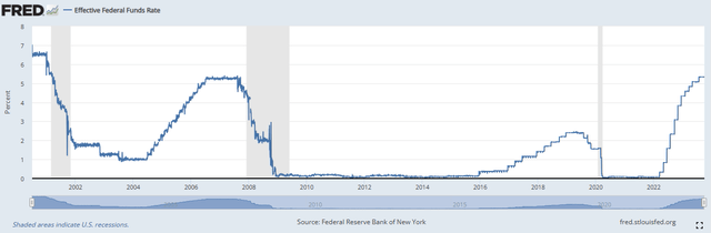
Effective Federal Funds Rate Chart (fred.stlouis.org)
It’s also clear from the chart above that the pace of rate hikes has been much quicker as evidenced by the almost vertical slope compared to prior hike cycles, which have shallower slopes.
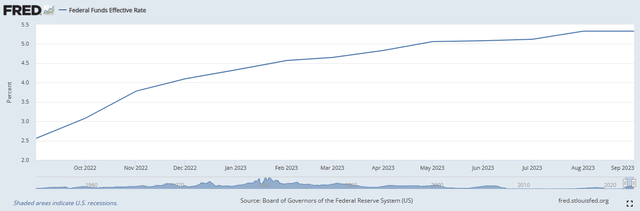
Effective Federal Funds Rate Chart 1-Year (Effective Federal Funds Rate Chart)
We’re at a point where the Fed seems content on holding rates steady so a natural question is how long might that last? The most recent rate hold period lasted from the end of December 2018 through about mid-July 2019 and marked the first attempt to end the ZIRP/NIRP experiment brought on by the Great Financial Crisis. The effective funds rate only got up to 2.50%, lasting about 6.5 months, before switching back to rate cuts.
The second most recent, and more comparable in terms of where the effective funds rate was then and now, lasted from roughly July 2006 to July 2007 before the rate cut cycle began. In both of these cases, along with the cut cycle that started at the end of 2000, rate cuts preceded recessions.
Deflating the Ballooned Fed Balance Sheet
Investors are justifiably jittery if the Fed has completed its rate hike cycle and are now content on holding steady. While rates might be held at current levels for what historically might be up to a year, continued pressure mounts on markets as the Fed continues to bleed off its balance sheet in what’s so far been “QT-light”. The following chart shows that the Fed had indeed reduced its balance sheet over the last year.
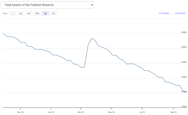
Total Assets of the Federal Reserve (federalreserve.com)
However, looking at how much the balance sheet has blown up since 2008 shows just how far the Fed has to go. The huge increase caused by the pandemic certainly didn’t help the situation.
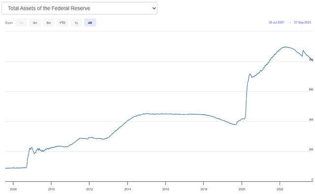
Total Assets of the Federal Reserve (2008-present) (Total Assets of the Federal Reserve)
Historical Returns Set To Normalize
Many credit the massive increase in the Fed’s balance sheet with fueling market returns since coming out of the Great Financial Crisis and the following chart supports that proposition. The chart below shows annualized returns by purchase date for every day anchored to today for SPY, excluding the last year.
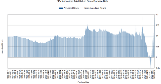
SPY Annualized Total Return By Purchase Date (1993-present) (Michael Thomas)
It’s evident from the chart that returns were juiced coming out of the Financial Crisis bottom. Higher returns are expected from buying the low, but even purchases of SPY made years after the bottom have experienced above-average returns. The following table shows average annualized returns by year.
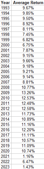
SPY Average Return By Purchase Year (1993-present) (Michael Thomas)
It’s noteworthy that all of the yearly returns are positive and that even those purchases made in 1993, having been through several boom/bust cycles, hit 9.67% on average. Also clear are the double-digit returns starting in 2008. Of course, these purchase dates have the benefit of seeing fewer tail-risk events but also benefit from historically easy monetary policy. The worst years to buy SPY were 1999-2000, but even those investors managed close to 7% returns for impeccably bad timing.
The following chart shows another angle at measuring historical returns. The chart shows every possible 1-year holding period from 1993-present.
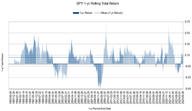
SPY 1-yr Total Return (1993-present) (Michael Thomas)
Most of the periods yield positive results, and the main negative periods are focused on major tail risk events like the Tech Crash and Financial Crisis, and more recently Pandemic Crash. Overall metrics for the period are given in the following table.
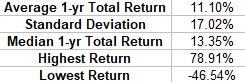
SPY Average 1-yr Total Return Metrics (1993-present) (Michael Thomas)
The average return of 11.10% over the entire period only really occurs from 2008 onward when reviewing the by-year average data covered earlier. All of the years prior don’t hit double digits. It is a tale of two worlds, before and after the Great Financial Crisis. Or before and after ZIRP/NIRP and a ballooning Fed balance sheet. The median return of 13.35% sits well above the average return of 11.10% and goes to show how much big negative returns can impact overall return.
The following table breaks up return data into percentiles to give another helpful view of the data.
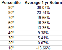
SPY 1-yr Total Return Percentiles (1993-present) (Michael Thomas)
The ZIRP/NIRP and QE that followed the Great Recession had clear and major impacts on market returns, and investor expectations, and now it all needs to unwind. The quickest and most probable way is a major market correction and the Fed may not be able to provide a backstop this time. Investors should prepare.
Hedging The Downside Risk
One way to participate in potential price appreciation while providing a set amount of downside protection is to create a buffered position with LEAPS (long-term equity anticipation options) options. For example, while owning 100 shares of SPY at ~$420 the buffered strategy involves simultaneously buying a bear put spread and selling a short call option at the Jan 16 2026 expiration as shown below.
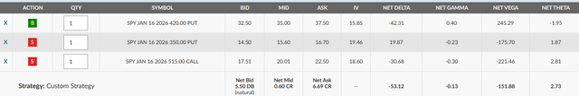
SPY Hedged Position with LEAPS Example (Michael Thomas)
The options position should be opened at net even or for a slight credit, and using the farthest-dated LEAPS provides the largest amount of downside protection but also reduces the annualized return that can be achieved. This particular trade gives downside protection down to the $350 strike, roughly 17%. This means that the first 17% of losses are hedged before the position starts realizing losses.
On the upside, potential returns from price appreciation are capped at the $515 call strike. This limits price gains to 22.61%, or 9.56% annualized. Since shares of SPY are held we’re also entitled to receive dividends. While not guaranteed, we can reasonably expect to add the current yield of 1.55% for SPY to increase the annualized return potential to 9.56% + 1.55% = 11.11%.
So at the end of the day, we’ve created a position on SPY that can capture total returns up to 11.11% annualized while hedging the first 17% of losses. That 17% downside protection isn’t likely to cover the entire downside of a significant tail-risk event. Covering even half the loss while capping potential gains at what is likely above the expected future return anyway seems like a good deal. The short put and short call strike selections can also be modified to suit other risk/reward profiles.
We can also wait and see if implied volatility continues to increase before putting the trade on as higher IV will expand the amount of downside protection for the LEAPS hedge.
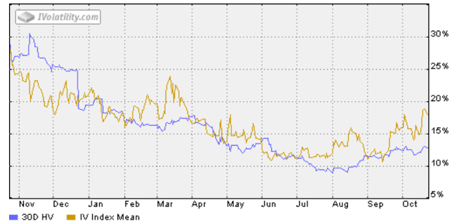
SPY IV Chart (ivolatility.com)
Conclusion
The end of easy monetary policy marks the end of the decade-plus-long punch-bowl era for markets. Complacent investors perhaps got too comfortable with the idea of double-digit market returns forever into the future. The realization of history repeating itself in some variation justifiably raises red flags and it lies not in rising rates, but when rates get cut again. So it becomes more and more difficult to stay invested with the idea of just eating whatever tail-risk event is about to happen and that over the long term…you’ll be fine. Without a hedge to protect against at least some downside risk, I rate SPY a sell.
It is very prudent to provide at least some form of downside portfolio protection. The buffered LEAPS strategy provides just that with what may be acceptable opportunity cost when considering future market returns will likely not be as robust as what investors got used to. Trade in those double-digit expectations with mid to high single-digit market returns moving forward and protect yourself in the process.
Read the full article here
 2026-04-08")
")
 (NASDAQ:MU)")
")